
Navigate
JavaScript Tutorial for Beginners
The Ultimate CSS Tutorial for Beginners
Data Structure Tutorial for Beginners
ReactJS Tutorial for Beginners
Java Tutorial for Beginners
Node.js Tutorial for Beginners
SQL Tutorial for Beginners
Responsive Design and Media Queries
Content
- Responsive Design and Media Queries
- What is Responsive Design?
- Media Queries
- Flexible Layouts
- Flexible Images
- Updated on 10/09/2024
- 450 Views
What is Responsive Design?
Designing web pages to look good on all devices (desktops, tablets, and phones). Uses flexible layouts, flexible images, and media queries.
Media Queries
Apply different styles for different devices.
Flexible Layouts
Use percentages and relative units (e.g., em, rem) instead of fixed units (e.g., px).
Flexible Images
Make images responsive by setting the max-width to 100%.
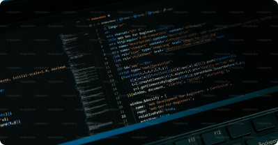
Example
image
Activity
Create a responsive webpage using flexible layouts, images, and media queries. Test the webpage on different devices.
Quiz
1. What is the purpose of responsive design?
- a) To make web pages look good on all devices
- b) To add animations to web pages
- c) To make web pages load faster
- d) To make web pages more interactive
2. True or False: Media queries are used to apply different styles for different devices.
- a) True
- b) False
3. Which unit is often used for flexible layouts?
- a) px
- b) em
- c) cm
- d) in
4. How do you make an image responsive in CSS?
- a) max-width: 100%;
- b) width: auto;
- c) height: 100%;
- d) all of the above
5. True or False: Media queries use the @media rule.
- a) True
- b) False
Unlock Expert Career Advice For Free